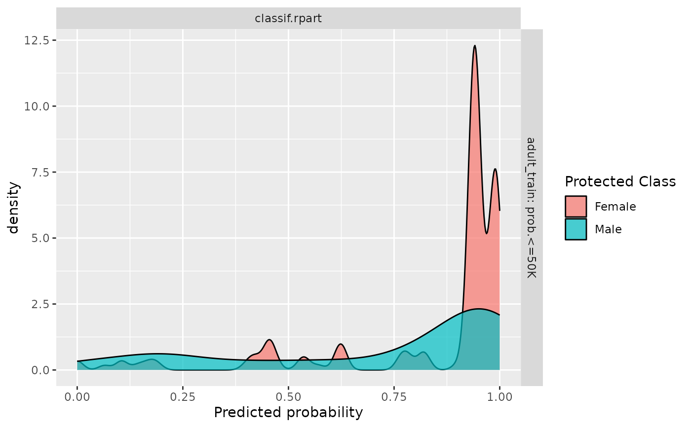
Visualizes per-subgroup densities across learners, task and class. The plot is a combination of boxplot and violin plot. The y-axis shows the levels in protected columns. And the x-axis shows the predicted probability. The title for the plot will demonstrate which class for predicted probability.
Arguments
- object
(mlr3::PredictionClassif | mlr3::ResampleResult | mlr3::BenchmarkResult)
The binary class prediction object that will be evaluated. If mlr3::PredictionClassif, a mlr3::Task is required.- ...
The arguments to be passed to methods, such as:
task(mlr3::TaskClassif)
The data task that contains the protected column.typecharacter
The plot type. Eitherviolinordensity.
Protected Attributes
The protected attribute is specified as a col_role in the corresponding mlr3::Task():<Task>$col_roles$pta = "name_of_attribute"
This also allows specifying more than one protected attribute,
in which case fairness will be considered on the level of intersecting groups defined by all columns
selected as a predicted attribute.
Examples
library("mlr3")
library("mlr3learners")
task = tsk("adult_train")$filter(1:500)
learner = lrn("classif.rpart", predict_type = "prob", cp = 0.001)
learner$train(task)
# For prediction
predictions = learner$predict(task)
fairness_prediction_density(predictions, task)
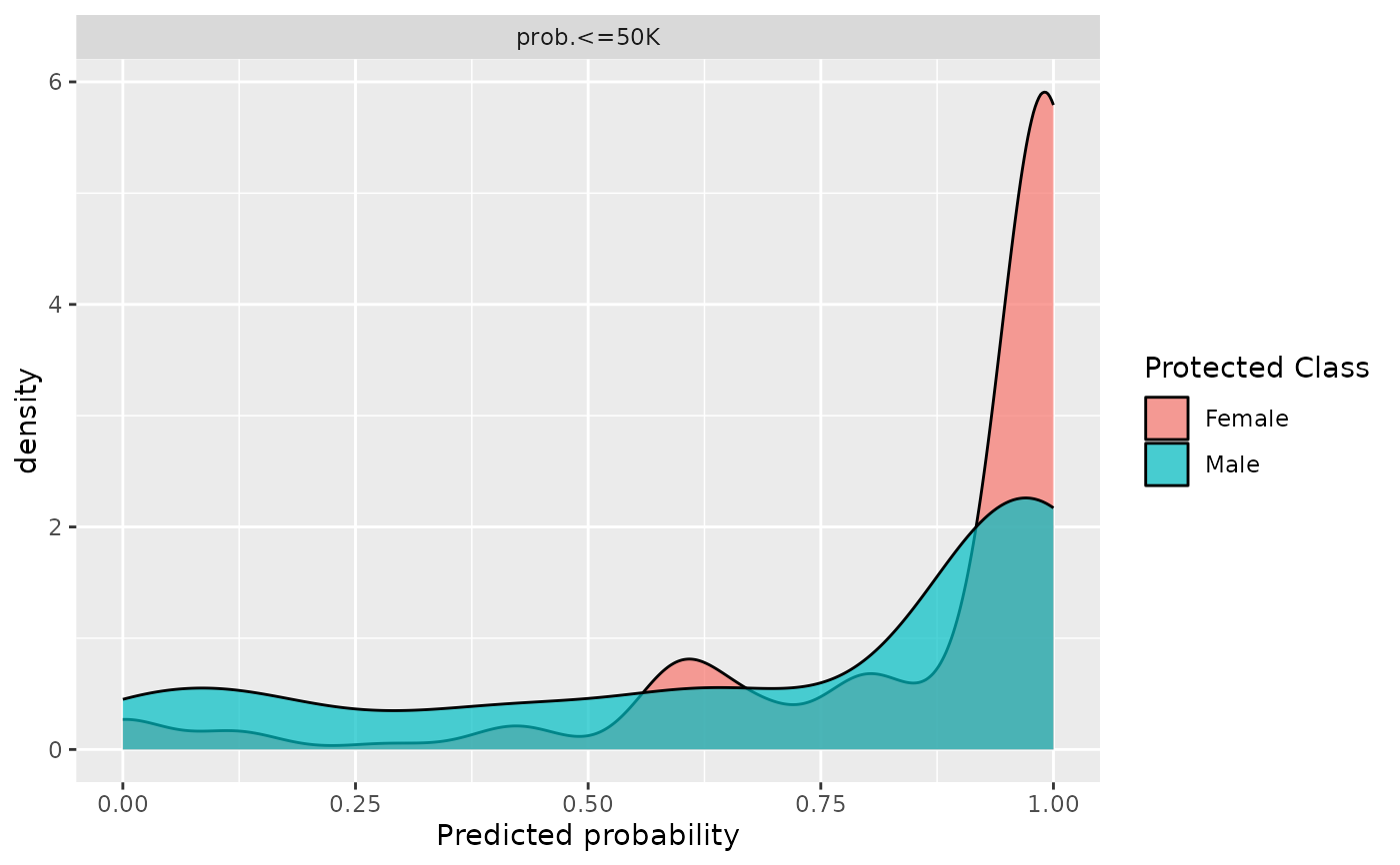 # For resampling
rr = resample(task, learner, rsmp("cv"))
fairness_prediction_density(rr)
# For resampling
rr = resample(task, learner, rsmp("cv"))
fairness_prediction_density(rr)